Ship Happens, Week 6: What most people get wrong about mobile web conversion and how to fix it
Ship Happens, Week 6: a deeper dive into how to fix mobile web site conversion with simple product led growth (PLG) tactics.
Happy Friday everyone! Welcome back to Ship Happens, your weekly product manager newsletter.
We’re taking a different approach this week, I wanted to dive into a specific topic and see how this feels. Subscribe here so you don’t miss the latest posts:
On with the show!
The Mobile Web Conversion Gap: Why Does It Matter?
We’ve all likely been there, and if you haven’t yet you will be at some point…
“Mobile traffic makes up 40/50/60% of all of our traffic. Conversion rate on desktop is 2x/3x/4x higher than on mobile. What did you fools break?! Fix it yesterday!!!”
You would think this kind of thing doesn’t happen anymore. Mobile has been around since I was 23! (that was a long time ago 😅) This is old news!
Well, yours truly didn’t get the same dialog as the above but I discovered this same old problem recently. Mobile traffic continues to rise around the world as more and more people experience the internet through their mobile devices.
I did a quick search on Perplexity for the latest figures:
63.38% of global website traffic comes from mobile devices (August 2024).
96.2% of internet users (5.35B people) use mobile phones for online access.
60-78% of eCommerce traffic originates from mobile devices.
Mobile drives 57% of global eCommerce sales (2024), projected to reach 62% by 2027.
73% of U.S. shoppers use smartphones for purchases.
Asia-Pacific leads mobile commerce, with 85% of online sales via mobile.
So if the mobile web version of your site experience sucks on mobile, you’re in a pickle. 5.35 BILLION PEOPLE are not gonna like it lol.

And unfortunately, usually people find that their desktop conversion is way better than their mobile conversion. This is normal, according to Perplexity on average there is a 1.5-3x advantage desktop has in conversion. But you can still expect to narrow this gap by 20-50% if you really focus on it.
Fortunately this isn’t my first rodeo so I know how to get moving on my OPPORTUNITY (not problem!) But I thought I’d publish this guide on how to fix mobile web conversion for you if you in fact run into this OPPORTUNITY yourself in the future.
Before we get into solutions, let’s cover first what people usually get wrong about mobile web…
Here’s what most people get wrong about mobile web conversion

Let’s do this in list form to make it easy on the eyes. This isn’t comprehensive, but covers the main mistakes people make:
Treating mobile as a smaller desktop, or neglecting it entirely: OMG, this happens SO OFTEN. The minute I see desktop mocks in a meeting my brain automatically blurts out “where are the mobile mocks?!” You really have to think about mobile to get it right. That includes thinking about things like
Slow loading times & loading indicators
Clunky mobile navigation (hamburger menu fest!)
Small form fields on mobile
Density of key actions on mobile
Ignoring mobile-specific metrics: Your metrics have to reflect what people experience on mobile, and your OKRs need to have that mobile lens. If you’re not tracking it, you’re not improving it!
Lack of a mobile optimization strategy: There needs to be a clearly defined strategy item to improve mobile web specifically, not some hand-wavy commitment to fix it. That never works.
Not testing and iterating: A/B testing everything is a good rule of thumb, but specifically you’ll need to test different patterns on mobile to see what works. Don’t just YOLO it, chances are good you’re not going to get it right out of the gate. I’ve written about this before.
Here’s how you can fix mobile web conversion
You’re probably thinking to yourself “okay guy I get it, everything I’m doing is wrong. Any suggestions on how to fix it Mr. Genius?” Why yes, I have those too!
I’m going to spoil it for you right up front: fixing this is a process. It won’t happen overnight. But with dedicated effort, you’re going to get there.
Identify your key mobile metrics
The first step is figuring out what you should improve on mobile. A good starting point is what you’ve already defined to be important for your UX already, and then optimizing there from a mobile lens.
Metrics for mobile web with that lens should include things like:
Google’s Core Web Vitals scores for mobile (at this point Google only cares about mobile 👀)
Mobile conversion rate, traffic, revenue per visitor (RPV), lifetime value (LTV), etc.
Key supporting conversion funnel metrics on mobile like searches conducted, product pages viewed, etc.
You might also want to optimize some mobile-specific features, I’d keep clear metrics on those features as well and measure their health over time.
Benchmark your mobile UX against desktop
Per the metrics from Perplexity above, this might sound completely delusional. If mobile web will always have lower intent traffic than desktop, what’s the point of comparing them?
I’d consider your desktop experience as a good starting point and aspirational. Why use that instead of outside experiences?
You already have all the data you need internally to make the comparison, easy peasy.
Your desktop data will account for all of the idiosyncrasies of your experience that are unique to your site. You won’t have to account for that like you would with an external site experience.
So shoot for the moon, and land amongst the stars! ✨
Evaluate your mobile UX, mobile comps & identify gaps
I’ve found it to be super informative to look at how great mobile experiences work, and then comparing that to your own experience to identify gaps to address.
Once you have your own core metrics identified as discussed above and your benchmark against desktop, looking through comps is even more powerful. You can really see how others address issues that you’re having, it almost kicks you right in the face.
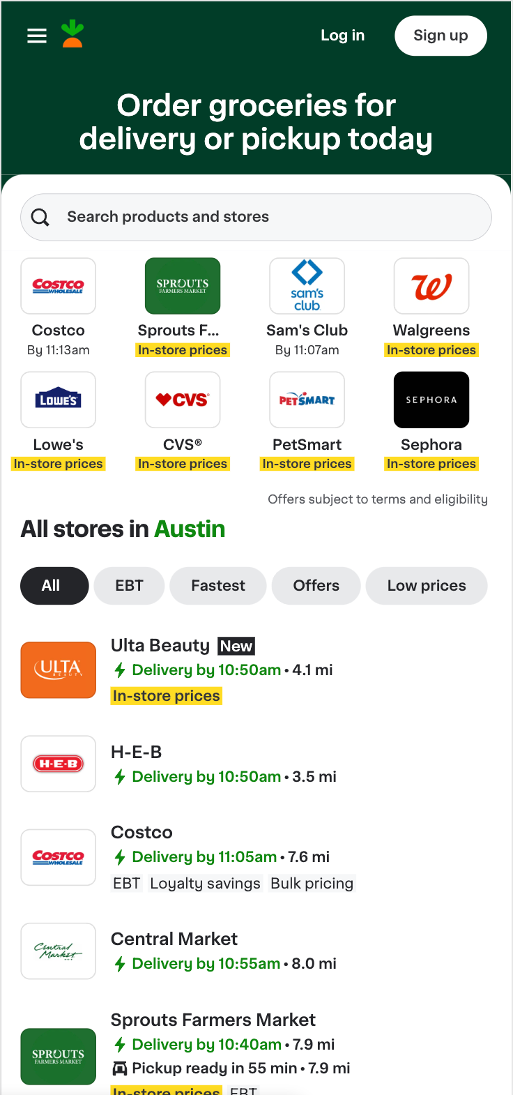
Here’s an example that I’ve been using on mobile of a great site experience, Instacart:
Look at all those beautiful CTAs and actions above the fold with that big, beautiful search bar.
Once you compare your own experience to the best in class experiences out there, you’ll be able to see the Matrix and the opportunities will show up in your field of vision quickly.
Conduct a mobile usability audit
Since you can see those opportunities now, start writing them down! Go screen by screen, catalog how best to improve.
For me, I found that once I did those first few steps, the ideas kept coming as I was looking through our experience.
But don’t just take your concepts at face value, marry them up with your user’s feedback…
User test your site on mobile devices
Get your users to tell you what they hate hate hate about your experience on mobile devices. I’d bet $100 that they have a lot of problems with your mobile website.
Once they get the gift of being able to tell you about them, you’ll be overwhelmed with their feedback once they get going. Give them that gift of giving you feedback. 🎁 And you’ll get the best gift of all, user feedback, right back!
Catalog, prioritize and implement your mobile improvements:
Now that you have all of those wonderful ideas that you’ve cataloged from your audit and from your user testing, you have to do that pesky prioritization exercise.
I like to open something like Amplitude, look at volume and revenue going through the experience, and match up friction points with where the data is saying there are friction points.
For example, if users are filtering way less on mobile than they are on desktop, and all of your filters are hidden in a small filter button in a corner somewhere…you should fix that! And if searches with filters have direct revenue impact, i.e. users that filter in their search are more likely to convert, prioritize fixing it!
This probably could use a post on its own, but for now prioritize what you want to fix, work with your eng team to implement, rinse, repeat.
Conduct continuous mobile web testing and optimization
After the low hanging fruit is addressed, it gets harder and harder to drive better mobile web conversion, as with most things in life. So you have to rinse, repeat. Wax on, wax off.
But if you stick to the overall process above, you’ll get better and better at building great mobile web experiences and be better able to rise to the challenge.
Get out there and start building better for mobile web! 🤘
That's it for this week!
If you've found this helpful, please consider showing your support by subscribing:
And please consider becoming a paid subscriber at $5/month or $50/year. I'm going to start sharing things like my resume template, resume reviewer for paid subscribers only. So consider going paid to get some of those great benefits.
Finally, share with someone else that you think would find this useful:
I’ll be back around this time next week with more useful product manager things!


